A Journey into Color Perception
Deciding on a paint color for your space can often feel like a daunting task. However, fear not! Our newsletter is here to provide you with valuable insights and guidance on how understanding room color psychology can streamline this process. By delving into the meanings behind each color and their effects on mood and ambiance, we aim to equip you with the knowledge needed to make informed decisions about your paint colors.
Whether you’re aiming to create a vibrant and energetic atmosphere or seeking a tranquil and calming retreat, we’ll explore how different hues can help you achieve your desired ambiance.
Read on to join us on this journey so we can help you with our expertise of color psychology! Please let us know if this has been helpful and we can be of help.
Cool Colors vs Warm Colors
At its core, there are two primary categories of paint colors that influence your emotional state: warm and cool tones. If you refer to a color wheel, as shown, you’ll notice that half of the colors fall under the warm spectrum (red, orange, and yellow), while the other half belong to the cool spectrum (purple, blue, and green). The terms “warm” and “cool” typically depict the emotional response that they bring to us within a space.
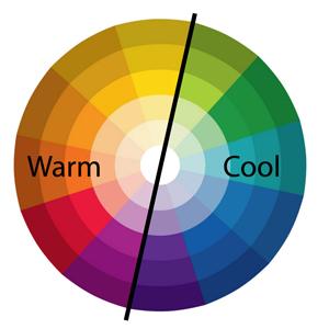
Warm tones exude vibrancy and can evoke feelings of happiness and vitality upon entering a room. Conversely, cool tones offer a sense of tranquility, encouraging relaxation and a sense of calm. Deciding whether you desire a space that energizes or soothes can significantly narrow down your color options.
Furthermore, within the warm and cool categories, every individual paint color possesses its distinct emotional sensitivity. Recognizing the impact that these colors can affect your mood significantly enhances your ability to choose the ideal color palette for your space.
Trust me to guide you in selecting the perfect color palette that not only reflects your personality but also fills your space with an undeniable sense of warmth and positivity.
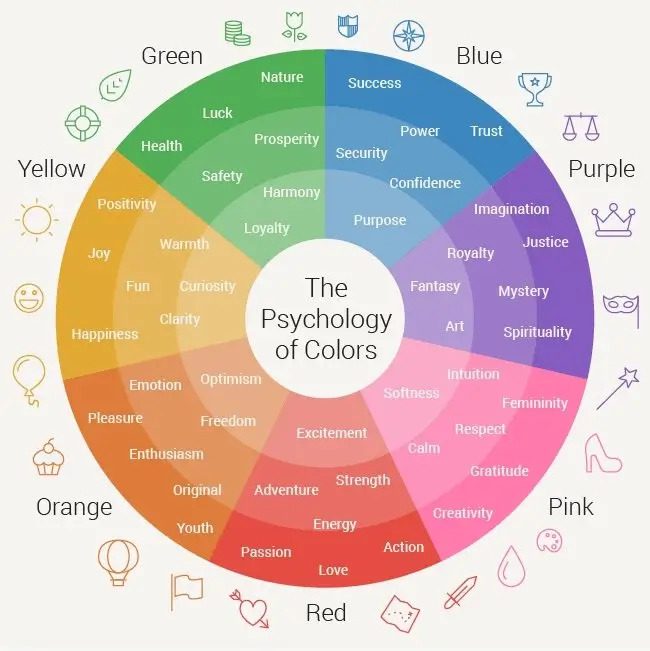
The Meaning of Color
Red Rooms:
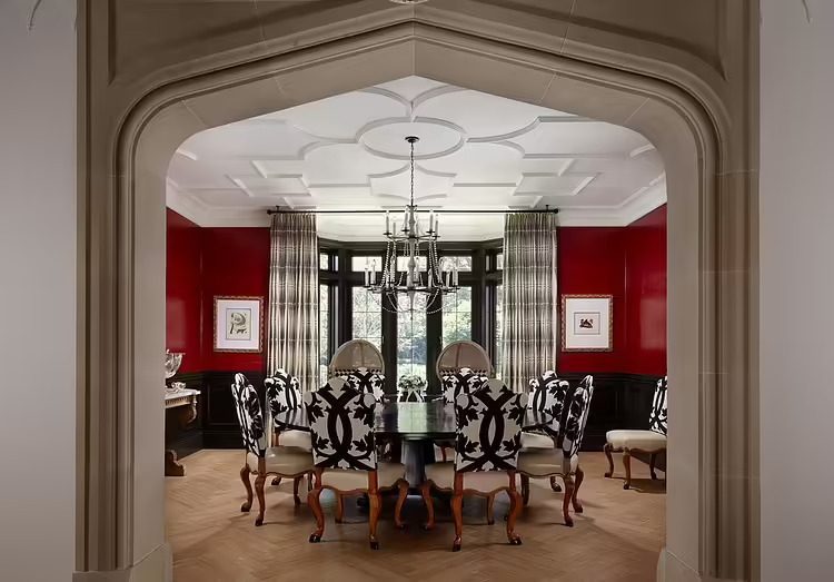
In my opinion, the color red exudes remarkable intensity, effectively elevating the energy within a space. Its vibrant presence fosters lively conversation and enhances appetite, rendering it an ideal choice for dining areas and kitchens.
It’s no surprise that many restaurants opt for red hues, given its beneficial impact on business. Nonetheless, red’s stimulating properties extend to physiological effects, including heightened blood pressure, heart rate, and respiration.
Consequently, while it invigorates, it may not be conducive to relaxation, making it less suitable for bedrooms or spa bathrooms aimed at fostering tranquility.
Pink Rooms:
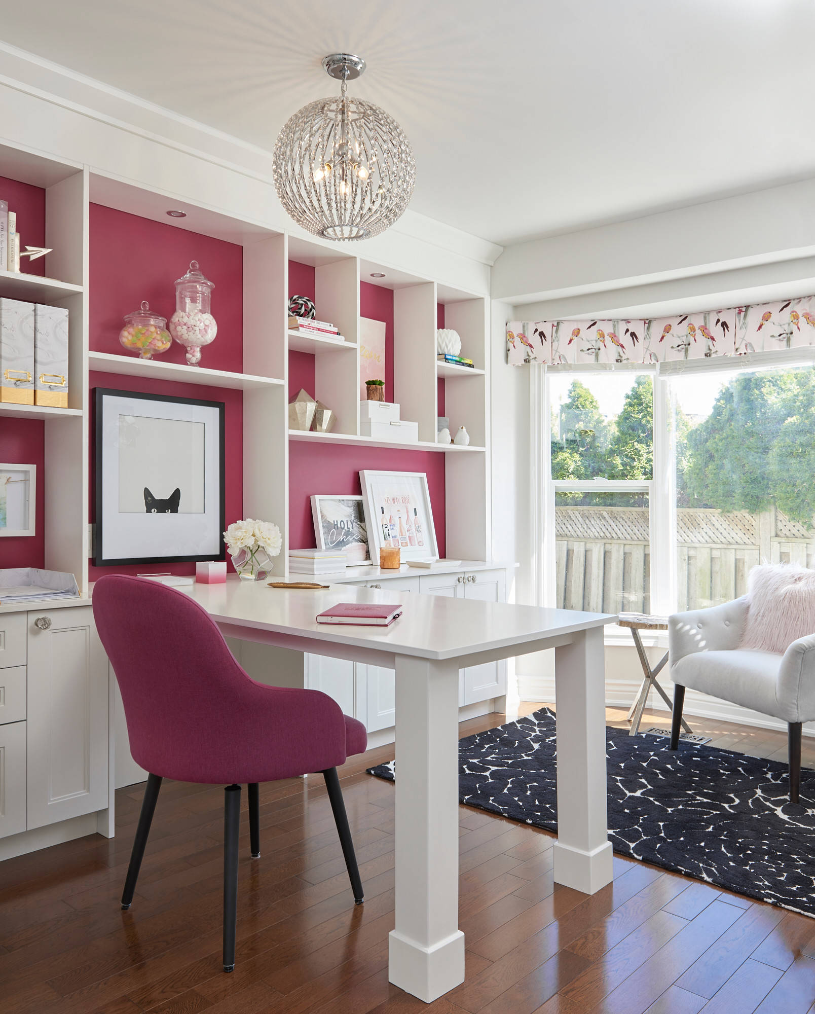
Despite being a tint of red and retaining the warmth associated with such hues, pink uniquely influences mood in a distinct manner.
Studies have demonstrated that pink fosters a sense of tranquility and diminishes aggression.
This effect is so pronounced that certain football teams have taken to painting the visiting team’s locker room pink, aiming to hamper their opponents’ performance on the field.
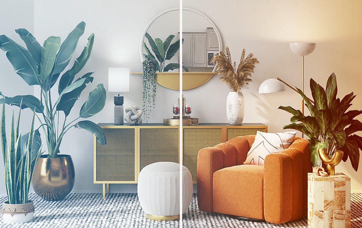
Orange Rooms:
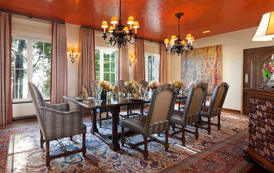
Orange, a vibrant and playful hue, shares many traits with red in terms of its energizing qualities but lacks the adverse effects such as heightened blood pressure.
Some even suggest that it imparts a sense of youthfulness. Certainly, this modern orange dining room exudes an ambiance perfect for lively dinner conversations.
For those familiar with my tastes, it’s evident that orange room decor isn’t typically my preference (I even avoid it for fall decor!).
However, I’m enamored with the manner in which it infuses warmth into this sleek space, preventing it from feeling overly sterile.
Yet, this does draw attention to one of orange’s drawbacks: it’s frequently selected as the least favored color by many. Thus, if selling your property is on the horizon, opting for orange might not be the most prudent choice.
Yellow Rooms:
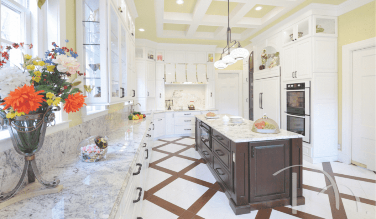
Yellow radiates cheerfulness and optimism. In a bright yellow kitchen eating area like this, it’s nearly impossible not to feel uplifted.
As an interior designer, I can’t help but feel a genuine affection for the color yellow. To me, yellow embodies the warmth of sunshine, that never fails to bring me feelings of joy and vitality within a space.
Yellow is believed to enhance focus, making the kitchen an ideal spot for studying in this household. In entryways, yellow extends a warm and inviting ambiance. However, it’s essential to note that the eye is naturally drawn to yellow before other colors, making it the focal point when used alongside other hues.
For this reason, bold yellows are typically most effective as accent colors or in smaller rooms.
Additionally, it’s worth considering that yellow is known to elicit the most tears from babies, so using it in a nursery may warrant careful consideration.
Purple Rooms:
:max_bytes(150000):strip_icc()/170948972_459051348732223_4960112359004710793_n-9795da43c2894a37be8d6edda2b92540.jpg)
Purple embodies a sense of spirituality and creativity, evoking strong reactions from individuals, who either adore or abhor it.
The selection of purple as Pantone’s color of the year in 2018 sparked particularly fervent opinions, showcasing the polarizing nature of this hue.
Furthermore, purple symbolizes opulence, affluence, and authority, often linked with regal connotations.
Perhaps this association is why many favor it in master bedrooms.
As the darkest color in the spectrum, purple typically recedes within a color scheme.
Blue Rooms:
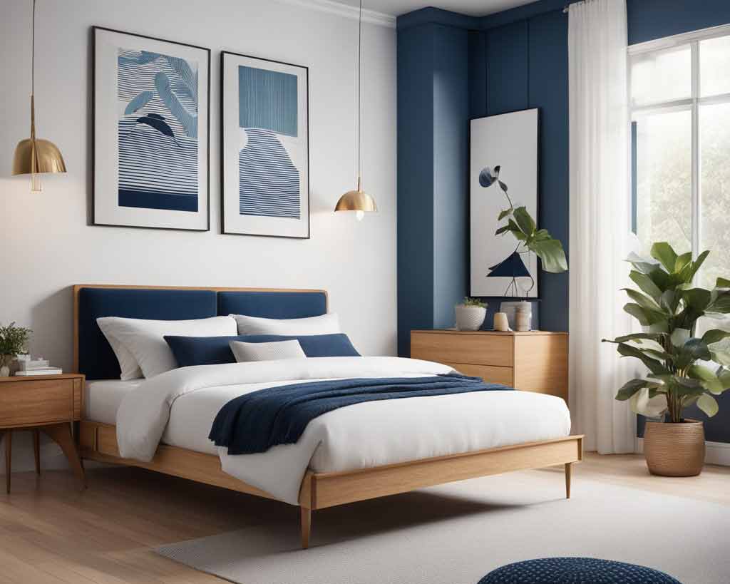
Did you know that blue is America’s favorite color? It stands out as the most soothing among all colors, renowned for its ability to decrease heart rate, slow respiration, and reduce blood pressure, making it a popular choice for bedrooms.
Moreover, blue is believed to curb appetite, making it potentially beneficial for kitchen spaces, especially for those on a diet.
Symbolizing trust, dependability, and stability, blue garners more favoritism than any other color, likely due to its calming influence.
Its capacity to enhance clarity of thought and productivity renders it ideal for study areas or home offices. Incorporating pink accents ensures that a blue room maintains a sense of warmth, countering any perceived coldness.
Unlike green and purple, which contain warm color components, blue remains untouched by warmth, potentially resulting in a room feeling overly cool.
To offset this, introducing warm colors and textures offers a straightforward solution to maintain a balanced aesthetic.
Green Rooms:
Green, known as the most relaxing color on the color wheel, emerges as the epitome of tranquility and relaxation. Its serene aura makes it a prime choice for spa bathrooms and peaceful bedrooms, where its calming influence is warmly welcomed.
Opting for a green hue in your living space is said to even ward off nightmares, making it an ideal selection for bedroom walls, particularly in children’s rooms. Derived from a blend of yellow and blue, green inherits the soothing qualities of blue while retaining the vibrant charm of yellow, striking a harmonious balance that prevents it from evoking the chilliness sometimes associated with blue tones.
Moreover, green is believed to alleviate stress, further cementing its status as a go-to color for spaces where relaxation is paramount. I would use green for a cozy reading nook or a laid-back lounge area. Incorporating green into your decor invites a sense of calm and rejuvenation, encouraging you to kick back and unwind.
But what about Black and White?
After returning from the 2024 High Point Market…
Stay tuned for Part 2 of The Psychology of Color with Arlene Bobb Interior Design where we will go over the concept of black and white and more!
Enjoyed this article? Check out more of our blog posts here! Make sure to follow our Instagram!