Decorating is all about the things you do; the colors you pick, the furniture you love, and the accents you choose to finish your space off with that perfect look that you’ve been waiting for. Decorating is also about the things that you don’t do (or more commonly that you do and then undo). An editorial eye is one that’s always looking for things that can go, either because they don’t fit or because it’s just too much of a good thing. Exercise your editorial eye for long enough, and you’ll find yourself running into the same missteps over and over, and not just in your work but in just about every room you walk into. That’s a good thing because knowing what not to do can be as useful (sometimes more) as having a firm grasp on what you should do. And just in case your eye isn’t quite as practiced just yet, here are a few things to look for the next time you take stock of your decor. And you’ll be surprised how often you see them, even in professionally designed rooms.
Don’t Choose a Small Area Rug
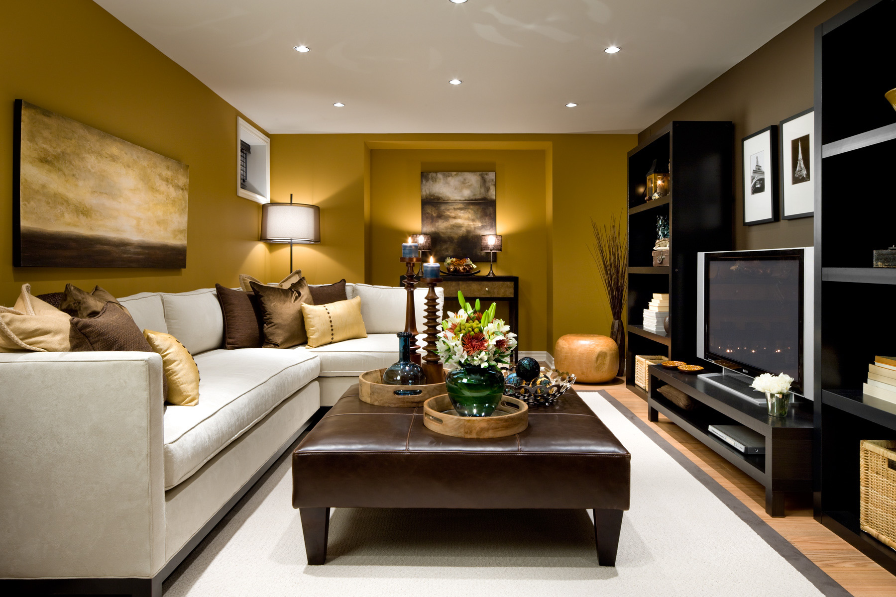
Are you using an area rug that is too small? Postage stamp-size rugs are one of the most common decorating mistakes. All of the furniture should be sitting on the rug. If this isn’t possible, the front legs of more solid pieces can be on the rug with the back two needn’t be. All four legs of smaller pieces should be on the rug.
Don’t Choose the Paint Color First
Never choose the paint color first. Paint is available in thousands of colors and can easily be changed. Choose your most expensive pieces first, then decorate around them.
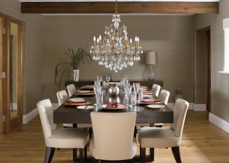
Don’t Hang the Chandelier Too High
Hanging chandeliers too high is problematic. You want to light up the room, not the ceiling. By attaching the chandeliers too high, you’re limiting the spread of light. By limiting the spread of light, your room will appear darker.
Don’t Hang Artwork Too High
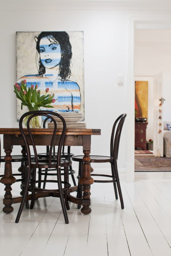
People tend to hang art closer to the ceiling than it should be. Artwork should be hung at about eye-level. This varies from person to person, so use your judgment. But it’s better to err on the side of lower rather than higher.

Don’t Choose Short Curtains or Drapes
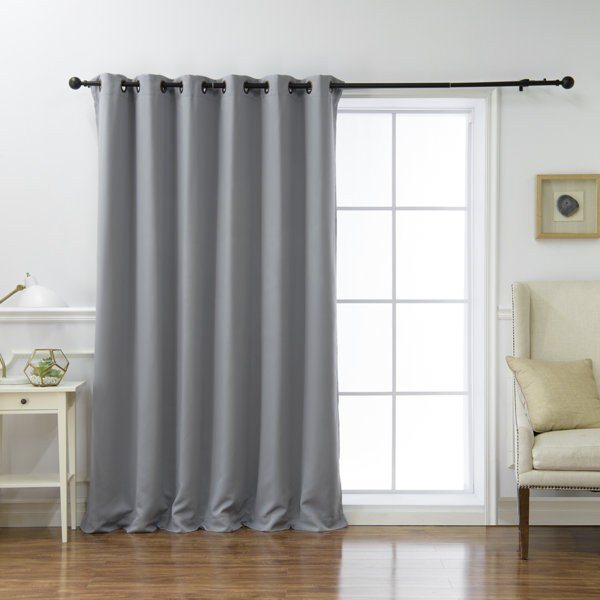
Curtains and drapes should skim the floor. It’s okay if they’re longer and they puddle a bit, but they should never be shorter. Curtains that are too short have the same effect as pants that are too short: they make the wall look truncated and shorter than it is.
Don’t Use Too Many Throw Pillows
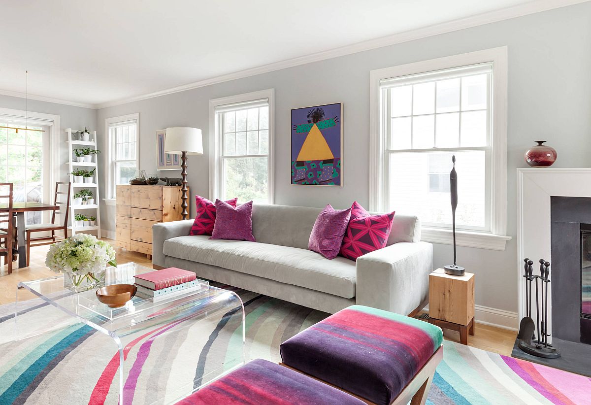
Throw pillows are great decorative accents but don’t use so many that you have to move them all off the sofa, chair, or bed before you sit or lie down. Just because it’s displayed that way in a store, it doesn’t mean the look should be repeated in your home.
Don’t Use Tiny Accent Pillows
The throw pillows you use should relate to the pieces of furniture you’ve selected. A small pillow on a large chair looks bitsy and lost.
Don’t Create a Theme Room
While they can be fun to decorate, people tend to get sick of them quickly. Theme rooms become old and outdated quick. Then, you’re stuck having to spend more money replacing items that you no longer want. Instead, try to add elements of the theme you like into a regular room. For instance, if you like jungle themes, toss in a few animal prints such as zebra print cushions, area rug or an ottoman.

Don’t Opt for Style Over Comfort
There are a lot of exceptional looking sofas and chairs out there that look great but are uncomfortable to sit in. Always think about how you’re going to use the piece before you purchase it and if you prefer a firm or softer cushion.
Don’t Push All the Furniture Against the Walls
Sometimes the room size can make this difficult, but try to pull furniture away from the walls to create more intimate conversation areas. This is particularly important in living rooms and family rooms. Some people are hesitant to show the backs of furniture pieces, but if they’re finished, there’s absolutely no reason why this should be so.
Don’t Rely on Overhead Lighting
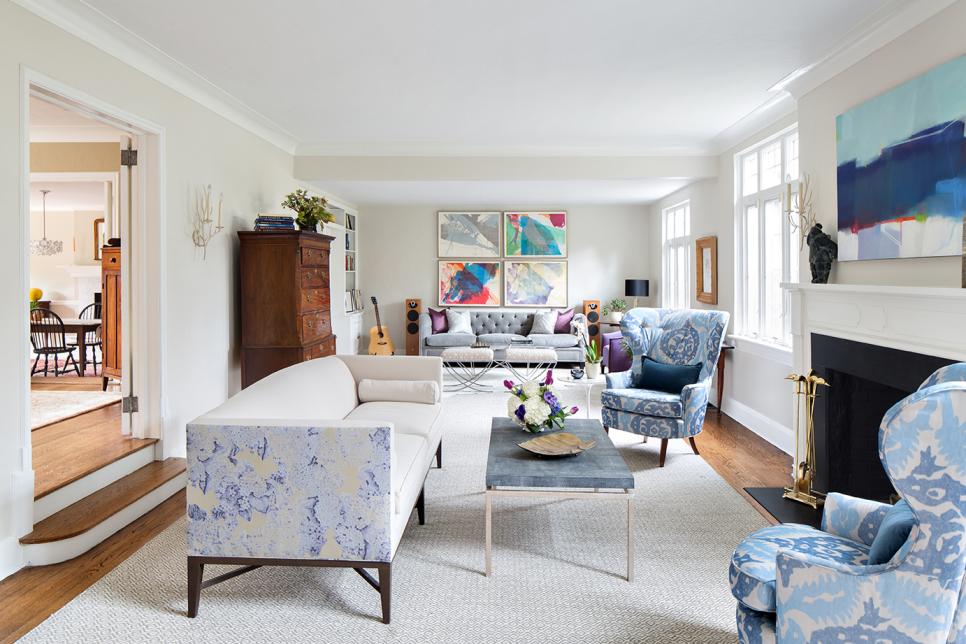
While overhead lighting is good to have, it doesn’t offer enough illumination, and it’s not particularly flattering. It’s better to have a mix of overhead, ambient, and task lighting. Use table lamps, floor lamps, sconces – whatever you like. Just be sure to use a mix. It will provide more light as well as make the room and everyone in it look better.
